Layer Basics
The elements list is divided into three groups - foreground, scroll Flow, and background. Each group of elements acts differently and the icons in front of the element groups give hint to their purpose:


The first image depicts background elements that are fixed to the screen. All other elements lay on top and cover parts of the background.
Above the background elements is the screen flow. Screen flow elements will move or flow on the screen as the user scrolls or navigates through the app. When you place an element in Scroll Flow, it automatically positions itself on screen after preceding elements within the flow.
Finally, the foreground contains another set of elements fixed to the screen, floating on top of Scroll Flow.
For a better understanding, click on the 3D button to the left (underneath the tools).
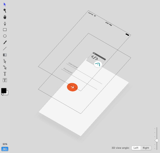
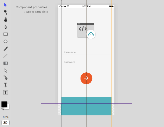
When the Scroll Flow overflows the screen, the content “below the fold” is shown with a checkerboard pattern. Now you can see both fixed and scrolling elements in context:
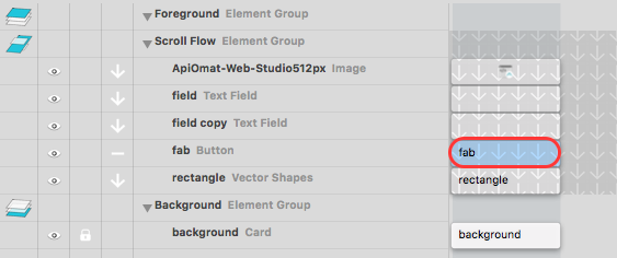
To move an element from one layer group to another, just grab the name of the element und drag it to the desired position.
Any layer or group can be hidden from the canvas by simply clicking the eye icon to the left (first column) of the layer name in the layer list. A visible eye icon indicates the layer is being shown.
Similarly, when clicking in the second column, a lock icon will appear. When clicked, this will show that the layer is now locked on the canvas, meaning it cannot be selected or moved without being unlocked first.
The behavior of the elements in the scroll flow can be managed in the third column. The arrow indicates that an element contributes to the scroll flow while the dash indicates the opposite. You can also navigate in the setting on the right to Layout > Layout Flow and make the changes there.
If you want to position two elements next to each other, set the first element to the dash and the last element to the arrow so that it contributes to the scroll flow.
Adding layers
The easiest way to add a layer is to pick one of the standard tools from the toolbar on the left. Now click on the canvas and drag to insert your shape. When you release the pointer, the shape will be inserted and you can start manipulating it in other ways.
There are a few shortcuts that give you some additional control. For example, when you’re inserting a rectangle, you can hold down the shift key to make a new square.
New layers are placed in the foreground by default.
Selecting Layers
To select a layer, simply click the layer on the canvas. Once the layer is selected, you should see a colored border around its edges.
Alternatively, you can use the Layer List to select a layer. Clicking the rectangle next to the layer’s name in the list will select it on the Canvas:
Grouping Layers
Select two or more shapes and navigate to Design - Merge Selected Elements. Note: This is an irreversible action .
Moving Layers
You can move a selected layer by grabbing and moving it around with the pointer.
Resizing Layers
Select an element and grab any of the edges or angles and drag them to resize layer. Hold down the Shift key to resize the layer proportionally; keeping width and height at the same ratio. Alternativley, select a layer and type its new dimensions in the Inspector to resize manually. (Layout > Physical Size)
Aligning Layers
To align layers, ApiOmat Studio offers three key concepts: overrides, alignments and keylines. Select an element and navigate to Layout in the settings on the right.
Overrides
Overrides let you make changes within a specific screen format or for a specific device. They are precision instruments for tuning layouts: you can do anything with an override, but it’s probably not the best tool to use in your normal routine. Tuning each individual screen with overrides can become tedious, time consuming work.
To create an override, double-click on a screen type in the device previews list. Now you’re in override mode, and any changes you make in the editing canvas will apply only to this format.
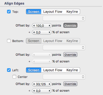
A dark grey colored Override button implies that this style is overridden for this specific format. This button can also be used to clear overrides.
Alignments
Alignments are much more generally useful than overrides because they can be used for different devices whithin one click. They can be used to constrain the position and/or size of an element within given limits.
By default, an element has alignments only on top and left. Alignment offsets can be specified in physical units (points) or percentages. This is how elements are always placed in ApiOmat Studio: when you drag an element, it changes the alignment offsets.
Switch on the alignments to the right edge to attach an element to the bottom-right corner. Put alignments on both sides to stretch an element to fill a space in one direction. For a full-screen element, turn on all four alignments.
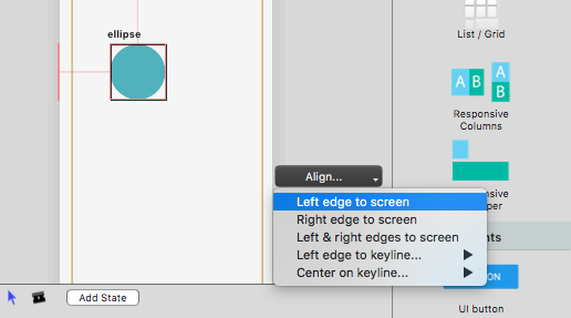
Alternatively, you can also select an element und use the Align... button on the canvas.
Keylines
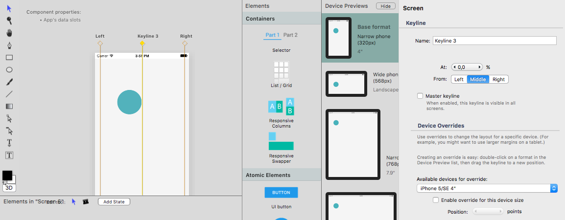
What really makes alignments useful is combining them with keylines. Keylines are customizable guidelines. In many cases it’s actually a good idea to start your design by making the keylines first.
A keyline’s position is defined in proportion to the screen. For example, when you place a keyline halfway across the screen, it will take up 50% of space in every screen format. Now you can use that keyline to align elements exactly to the center of the screen.
Hold down the Alt key to snap the selected element onto keylines. Check in the View menu to see if this feature is enabled.
